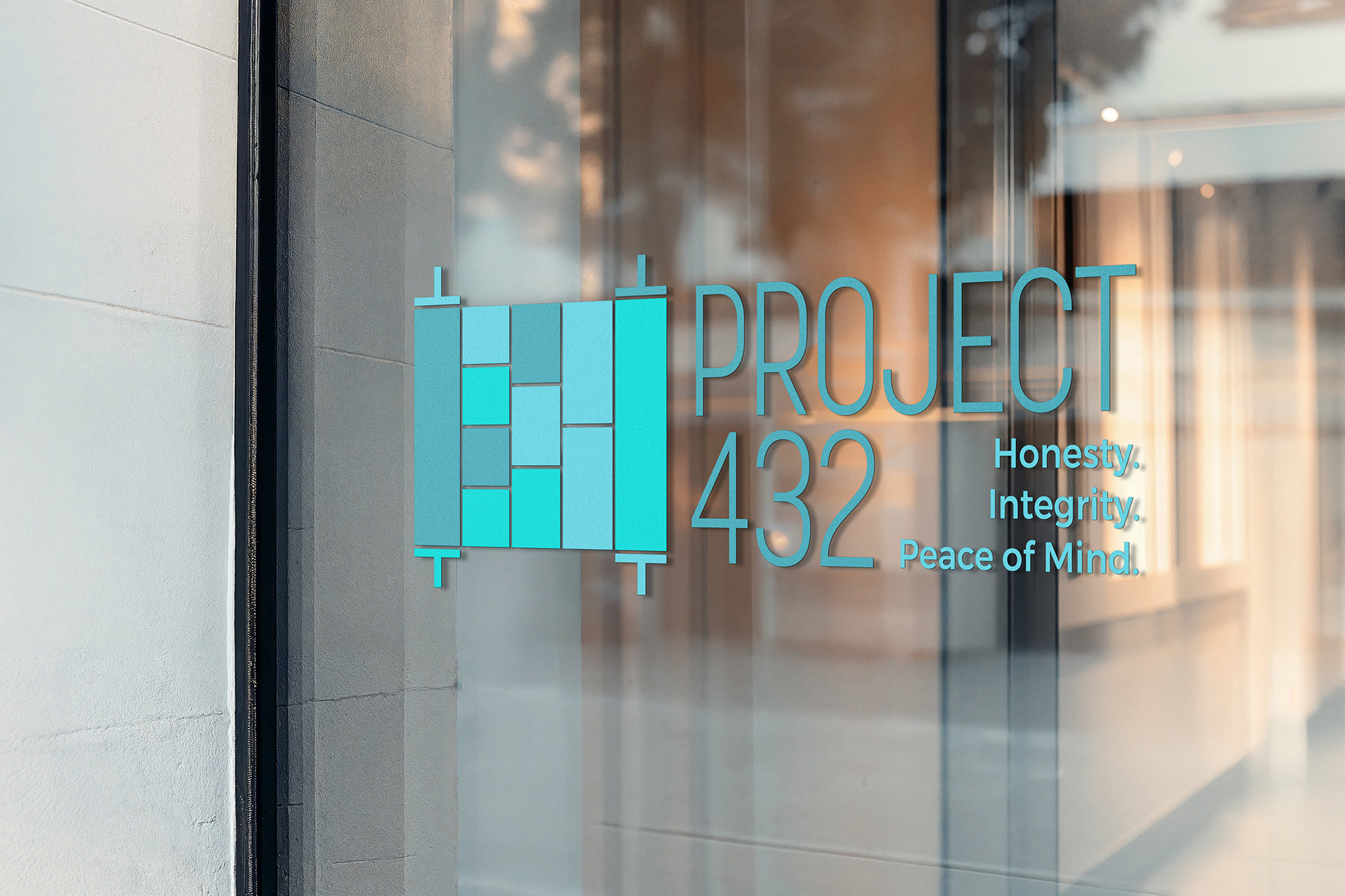
Every strong brand starts with a strong idea. BLMG opened with a discovery process to understand the heart of the initiative, the audience it would speak to, and the line it had to carefully balance between awareness and stigma. The result was a name with real meaning behind it: Project 432. The 432nd mitzvah in the Torah, according to the Sefer HaChinuch, is the mitzvah of yiras Hashem, a fitting anchor for a program rooted in ethical and financial integrity. The tagline followed naturally: Clarity, Integrity & Peace of Mind.
From there, BLMG developed the full visual identity, building a brand that felt confident and approachable rather than cautionary. A clean wordmark, a refined color palette, and a flexible design language gave Project 432 the look of a serious educational platform without the heaviness the topic might have invited.
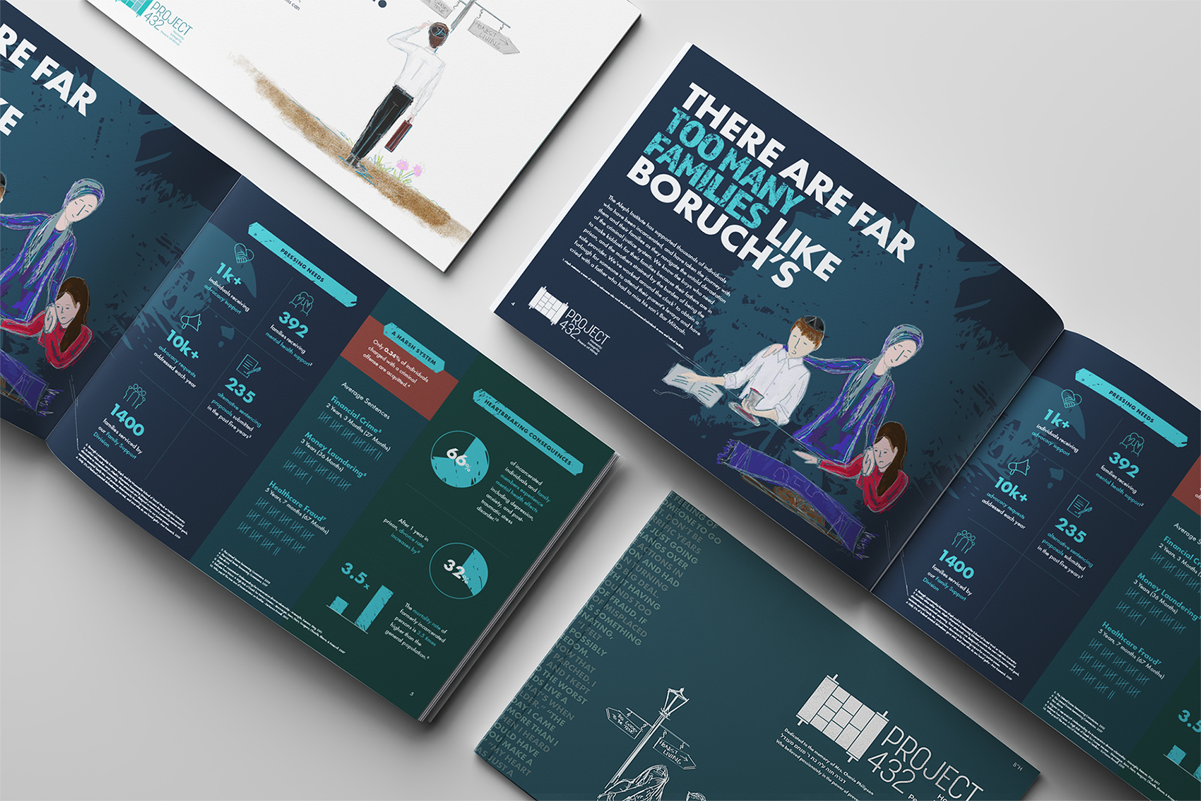
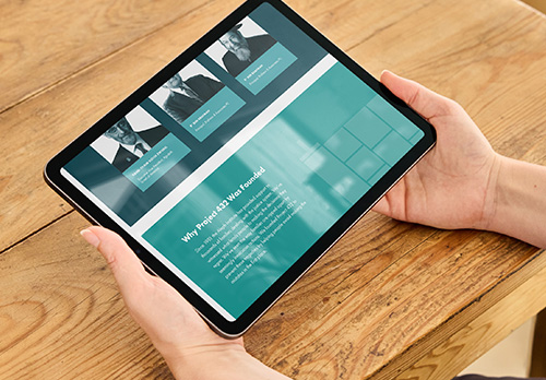
With the brand in place, BLMG produced a fundraising brochure that introduced Project 432 to potential supporters, walking them through the why, the how, and the impact of the work. The piece balances the weight of the issue with the optimism of prevention, giving donors a clear picture of what their partnership makes possible.
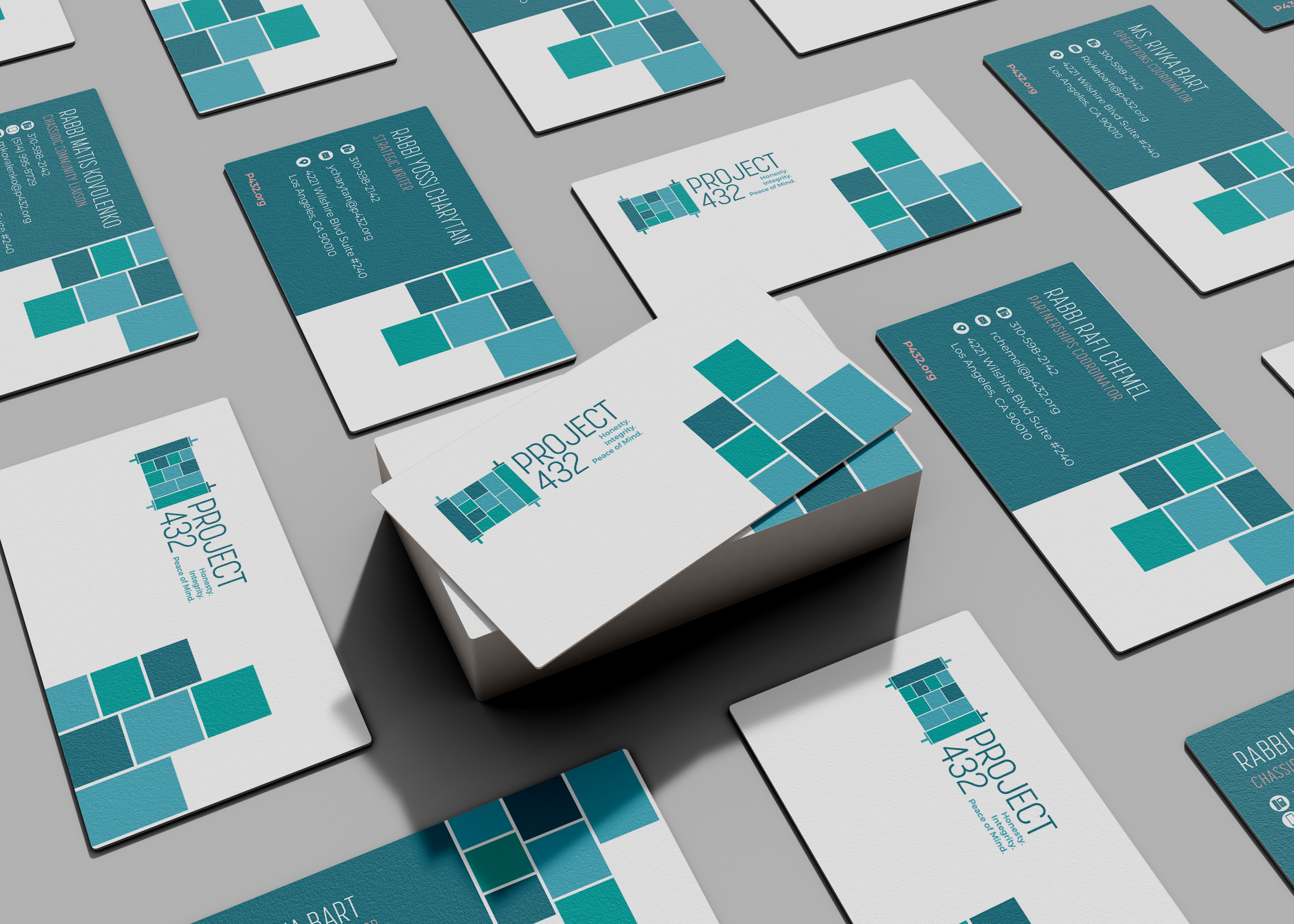
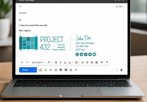
BLMG also built a custom website that serves as the digital headquarters for the initiative, with a structure designed to host workshops, curricula, news, and resources as the program grows. Uniform email signatures and business cards rounded out the rollout, ensuring everyone representing Project 432 carries a consistent, polished presence into every conversation. To future-proof the brand, BLMG delivered a complete design system the team can use independently, with guidelines for colors, typography, layout, and tone, so any content produced down the road stays on-brand without requiring a redesign each time.